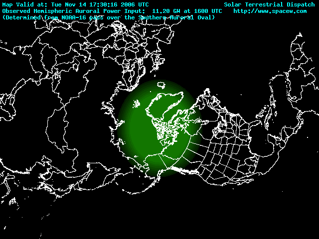
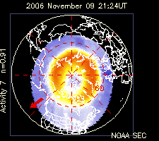
This plot estimates the VISIBILITY of auroral activity from any location in the northern hemisphere, assuming a dark moonless sky and low light pollution. It is updated every 5 minutes with the latest solar wind data(Link to updated info is provided in the link section to the right). The model computes the estimated brightness of auroral activity and plots this on the map as a solid bright color that varies from green (NIL to low levels of auroral activity) to brown/orange (low to moderate levels of activity) to red (moderate to high levels of activity). The brighter the red, the more intense the activity. Those areas which may be able to spot activity are most often within the zone of fading color on the outskirts of the plotted auroral oval. The extent of the fading color zone on the outskirts of the oval is based on the estimated height and intensity of auroral luminosity.
Use this chart to quickly determine whether auroral activity might be visible from your location and what intensity the activity might be. The image is created using a model that computes the potential auroral luminosity from current solar wind conditions. It has been verified for accuracy using historic POLAR spacecraft data. Although the model works very well and should provide visual observers with a good estimate of the visibility of auroral activity, it is not perfect and may occasionally under or overestimate the visibility of activity from some regions. This is due to the unpredictable nature of auroral substorm activity.
posted by World Radio Club at 9:42 AM
![]()

0 Comments:
Post a Comment
<< Home